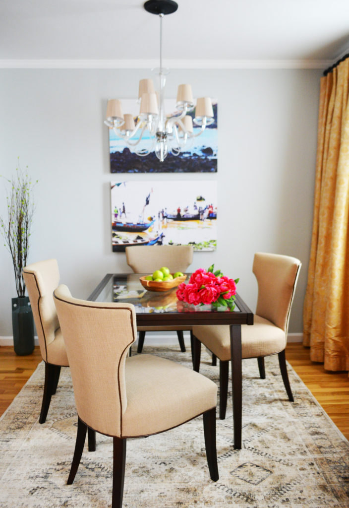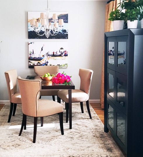
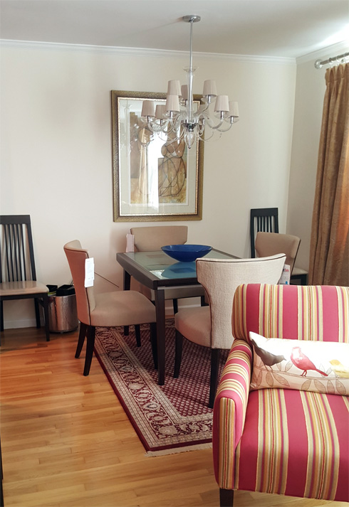
The way this dining room looked before did not represent my client at all! Odessa is a young professional in her late awesome 20s who is very funny, smart, stylish, and witty. And her dining room? It’s was boring and plain with a serious case of NEED CPR STAT! So, we revived it! Economically of course. Check out below her dining room makeover progress and completion reveal, including the 5 things that we did to liven up the space – which you may want to do to your space as well. Plus her kitchen counter walls received an elegant mosaic backsplash with no plaster involved and no ceramic tiles. Nope, it’s not paint either! See the scoop below.
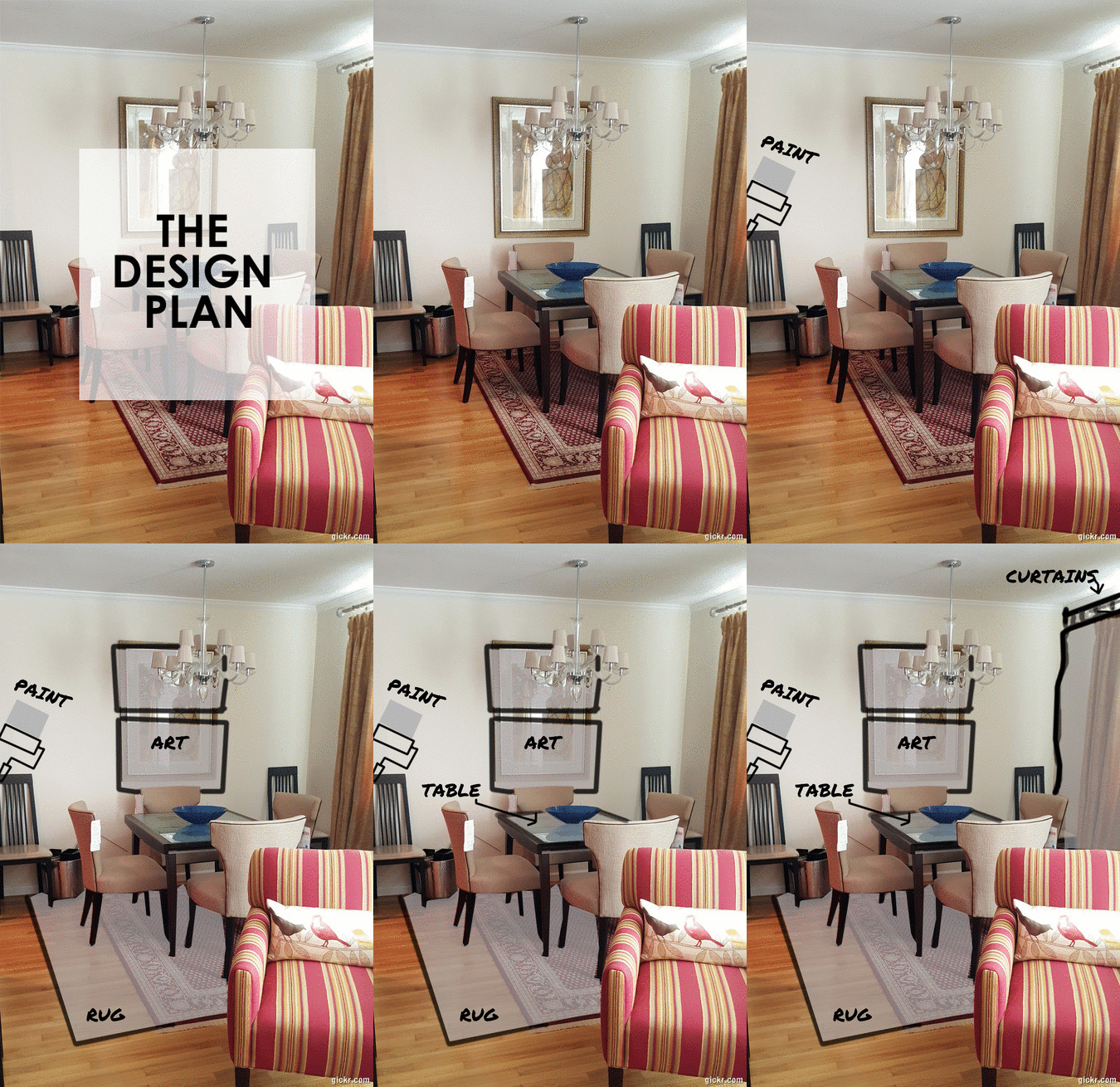
THE DESIGN PLAN
- ADD NEW WALL PAINT COLOR (cool color vs warm hue)
- REVAMP THE DINING TABLE
- GET A NEW RUG (current one was too small!)
- REPLACE ARTWORK
- EXTEND THE CURRENT CURTAINS
5 STEPS TO LIVEN UP THE DINING ROOM ECONOMICALLY:
We saved money by keeping the current curtains, dining chairs, and dining table. However there was ONE thing about the dining table that Odessa and I both agreed that we did NOT LIKE …… the frosted square design glass top had to go bye bye! The solution was to simply replace the frosted glass with a clear one! Easy breezy! We also changed the rug, art, and painted the walls. But enough, chit chat, let me show you the dinign room makeover progress and completion reveal . . .
STEP 1 – PAINT WALLS
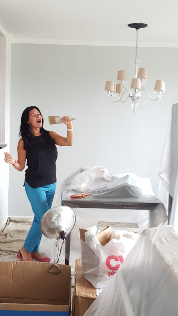
The wall color had to be changed! Why? It was too matchy matchy! It was a very pretty color, but a bit too monochromatic. Her furniture items (chairs, table, curtains, and rug) had warm color tones and since we wanted to revive her dining room, it was important that we painted it with a cool (as in temperature cool) color. Cool colors also tend to brighten a space! We went with a light cool gray paint color. The walls in these photos do not do the beautiful serene wall color justice, so squint and try to image a pretty cool gray color. My assistant Ginnette captured this pic below of me ‘attempting’ to sing … the wackier I get the more you know I am probably juggling a lot, so I turn to humor (and caffeine!) to keep us sane when overwhelmed with a lot of work.
STEP 2 – REVAMP TABLE

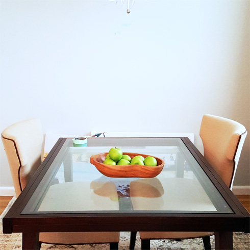
This is how it now looks, no frosted square panels. Just simplistic beauty with a solid clear glass top. . . .
When I do the initial walk thrus with my clients I always ask then to tell me 2 things:
- what do you love within the room
- what do you dislike
Within seconds of showing me the dining space Odessa said … “can we replace the frosted glass top?!”
Yes!!!! I said. I was so excited that we were on the same design page.
If she hadn’t mentioned it, I would had. I told you she is smart! Many times we know that we have to change something, we just don’t know why or even how. In this case, the ‘why’ was bec the frosted design is too contemporary (Odessa has more of a modern design preference!). Clear glass table tops gives a more sleek, refined, modern sophisticated look to the table. Below is a peek at the BEFORE and AFTER . . . .
Tada! Here’s how it looked afterwards ….
STEP 3 – get new RUG size
The original rug was just too small compared to the size of the table + chairs. Chairs would totally ‘fall off’ the rug when pulled out. So we added a larger size that had a better balance with the table and the floor space. I also introduced her to a rug design that was more serene in color and style. “Odessa meet rug, rug meet Odessa” . . . it was love at 1st sight (yaay!) . . . .

STEP 4 – ADD NEW (PERSONAL) PHOTO ART
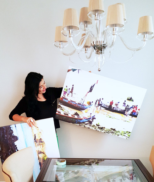
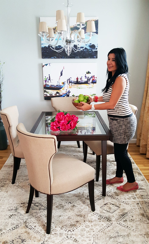
The artwork she had, though lovely, was too monochromatic for this stylish gal. So we relocated her art to another room. I wanted her dining to feel more personal to her so I asked her to look through her travel / vaca photos to show me photos that gave her that … warm fuzzy happy feeling. She send me about 5 and I helped narrow the selection to two that we would upload to print on a large canvas.
I especially love the photo of the fishing village in Ghana (the one I am holding below with my left hand). Besides the colorful pops of colors of the photo, the fish represents a food supply that we regularly enjoy in our dining rooms. Do you see now the ‘beautiful’ appropriateness of the photo?
By the way, holding those large canvas photos were a WORKOUT! Thanks Ginette for your quick photo action b4 my arms turned to spaghetti!
STEP 5 – CHANGE CURTAIN placement
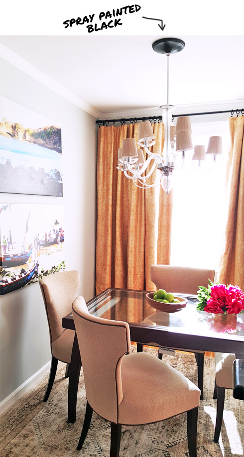
We saved money by keeping the curtains. But the placement was too narrow making the window look small and the curtains looks flimsy, so instead of having the sides of the curtain stop by the window frame, we extended it aaaaall the way towards the adjacent wall making the window look wider, and pumping the curtain with confidence strutting its cool self.
( EXTRA EXTRA READ ALL ABOUT IT )
Also, to maintain a cohesive color floor with the dark (brown black) color of the dining table we replaced the chrome (silver) curtain rod with a brown black color rod that extended to the edge of the adjacent wall. Plus, we spray painted the chandelier’s base (canopy) in black.
the BEFORE photo
the AFTER photo
